In the competitive landscape of consumer goods, the color selection for tinplate cans plays a pivotal role in product positioning. The chosen colors significantly influence consumer perceptions, thereby impacting purchasing decisions and fostering brand loyalty. This relationship is particularly pronounced when distinguishing between standard and premium products. Understanding the psychological impact of color on consumers is essential for brands aiming to establish a robust brand image and effectively position their products.
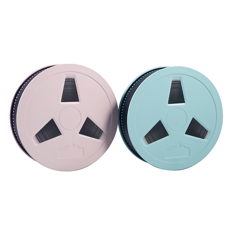 Color elicits emotions, conveys symbolic meaning, and resonates with consumers on a subconscious level. For instance, blue is frequently associated with trust and reliability, making it a preferred choice for brands seeking to convey dependability. Conversely, red can evoke excitement and urgency, which may be advantageous for products targeting younger demographics. In the context of tinplate cans, color selection must align with the intended product positioning. Standard products often utilize neutral or subdued hues to appeal to a broad audience, while premium products typically feature rich, vibrant colors that symbolize luxury and exclusivity.
The psychological impact of color extends beyond aesthetics; it also shapes consumers’ perceptions of quality and value. Premium products are often presented in colors such as gold, black, and deep jewel tones, which are linked to sophistication and prestige. These colors not only enhance the visual appeal of the tinplate cans but also reinforce the symbolic meaning of the product as a premium offering. Consumers are more likely to perceive products packaged in these colors as higher quality, justifying higher prices and fostering brand loyalty.
Moreover, color selection in tinplate can design is crucial for effective product positioning. Brands must consider their target audience and the emotions they wish to evoke. For example, a brand targeting health-conscious consumers might opt for green or earthy tones to symbolize freshness and sustainability. Conversely, brands aiming to appeal to the luxury market may choose metallic colors that reflect opulence. This strategic combination of color and product positioning not only enhances the brand image but also creates a cohesive narrative that resonates with consumers. 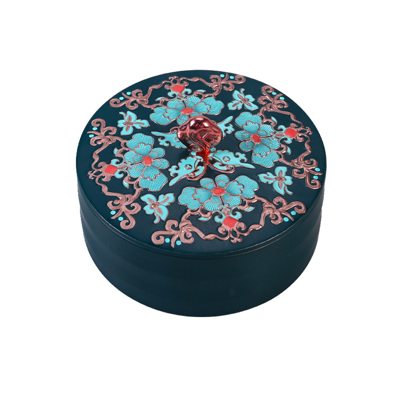
In summary, the relationship between tinplate can color selection and product positioning is a critical component of marketing strategy. By comprehending the psychological impact of color and its symbolic significance, brands can effectively differentiate between standard and premium products. A thoughtful choice of color not only influences consumer perception but also plays a vital role in shaping brand image and product positioning. As the market continues to evolve, brands that leverage the power of color in tinplate can design will be better positioned to capture consumer attention and drive sales.
Post time: Jan-04-2025


